Data is growing at a rate faster than ever before.
Up to 90% of the world’s data was generated in the last couple of years ~ Domo
And the volume of data only doubles in size every 2 years ~ Mckinsey
Yet, the sheer bounty of data is overwhelming to start with.
Not surprisingly, much of it can’t be easily accessed or coupled with other data, because it exists in different systems in raw format.
This is where the need for Data Visualization and Business Intelligence arises.
If you’re thinking of investing in a robust BI tool to help you visualize and analyze data, then Microsoft Power BI may have your vote!
Thinking about “Why is Power BI data visualization needed when there are tons of BI tools in the market?”
Your question holds merit.
The BI market is flooded with BI tools with a larger market share and promises to empower your business operations, but Power BI has Microsoft in the driving seat.
Power BI is not just another data visualization tool, mind you!
In 2023, Gartner Magic Quadrant for Business Intelligence and Analytics Platforms positioned Microsoft as a leader for the 16th year straight.
There’s a lot more to know about Power BI and its data visualization capabilities that you think.
Curious to know more?
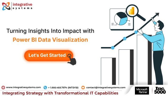
In this read, you will find some intriguing insights into the world of Data Storytelling and Data Visualization with Power BI and explore the most amazing ways businesses, like yours, turn insights into impact using Data visualization in Power BI.
Keep reading to find out!
Why Data Visualization is Important and How Power BI Data Visualization Can Help?
IT leaders, CEOs, CIOs, and decision-makers, answer this —
Amidst a busy day or a crucial meeting, when confronted with a complex piece of information, what would you prefer?
- Decoding reports filled with endless words OR
- Gaining insights briefly through immersive visualization.
Of course, you, being a progressive leader, have chosen option ‘B’.
There you have your answer to – “Why Data Visualization is important in the fast-paced business world?”.
Simply put – Data Visualization matters because of 3 components-
- Clarity
- Efficiency
- Impact
Data visualization can be leveraged to connect the dots, spot trends, form opinion & build data stories to draw firm conclusions.
Thinking about – “What data stories are, and do I really need storytelling mastery to convey my data effectively?”
It’s time to realize that, without storytelling, you stand a risk of entering a loop of prolonged decision making with biased insights.
This brings us to the realm of how to tell an impactful data story using Power BI data visualization.
Let’s dig deeper.
How to Tell a Good Data Story in Data Visualization with Power BI?
Thousands of business leaders, like yourself, leverage MS Power BI for their everyday data visualization needs.
Power BI Data visualization helps you tell an impactful data story by –
- Decoding complex, disparate data and underlining the key points.
- Adding value to your insights by turning raw data into actionable insights.
- Offering personal interaction by enabling users to interact dynamically with the data.
- Generating value by discovering hidden trends and patterns.
- Bringing in a sense of credibility with accurate data representation.
It’s time to realize that the better the usage of Power BI, the more streamlined your data visualization efforts are.
Are you now thinking – “Microsoft Power BI must be a magic tool that makes my data look good.”
It is indeed a magic tool, but it goes way beyond making your data look good.
Power BI makes your data more understandable, engaging, and actionable with its innate powerful visualization capabilities, empowering even the most complex data sets to tell effective stories and streamline decision-making.
A well-structured Power BI data visualization initiative enables everyone in your team, from ground-level staff to decision-makers, to interpret the data, connect the dots, build logical conclusions, make informed decisions, and achieve different business goals.
But how to find a good story with Power BI data visualizations, and more importantly, how to tell it better?
Let’s figure it out.
There are 4 elements of a good data story:
Step 1: Origin of the Data Story
The first task is to find the core message and establish relationships within the data to build a compelling origin of the story.
Step 2: Know the Audience
Secondly, get a better understanding of the audience to ensure the maximum impact and relevance of the story.
Step 3: Crafting a Narrative
Thirdly, craft an actionable narrative in a logical sequence. Starting with the background, crucial data points, and important discoveries, and finishing with actionable insights, just like your favorite movie, but with less popcorn and more pivot tables.
Step 4: Visualize Data Effectively
Next, leverage different Power BI data visualization types such as charts, bars, graphs, infographics, etc. to support the story and showcase data in an engaging and easier-to-understand manner, considering the non-technical audience.
It is important to note that the end goal is to boost understanding and complement the story without confusing the audience.
So that’s the right way to tell a compelling data story with data visualization Power BI.
Are you thinking — “Whether Power BI data visualization is the answer to most of your data analysis woes?”
It sure is!
Are you now thinking of analyzing and visualizing data with Power BI independently, without a well-targeted agenda?
If yes, you’re making a classic mistake of “Ready, Fire, Aim”.
Both time and resources will go in vain while you dig around the junkyard trying to do everything everywhere all at once.
While data visualization with Power BI is no rocket science and is easily accessible, many advance features would need the expertise of Power BI experts to unearth their absolute potential.
The expertise of Power BI consultants offers you an additional edge of expertise to make the most of Data visualization in Power BI.
Now with those anecdotes, we’re confident that you are enlightened about how Microsoft Power BI data visualizations can be used to tell a good story, and how Power BI consultants contribute to making you the hero of the story!
Moving on, it’s time to dive deeper and explore how you can leverage data visualization Microsoft Power BI for your BI needs.
How Power BI Proves Instrumental in Your Data Visualization Efforts?
Business intelligence, once accessible only to tech giants and government organizations, has been democratized by Power BI, making it accessible to everyone from startups, and business analysts, to lone professionals with a limited to $0 budget, kickstarting with their business intelligence and data visualization journey.
Here are the 3 incredible ways Power BI helps you transform the perception, and utilization of data visualization, setting new standards in the domain of data visualization.
Let’s look at them one by one.
1. Personalized Visualizations with Microsoft Power BI
Standard visualization formats such as pie charts, line charts, and graphs are great, but what if you had dedicated visualization formats designed to address your unique data visualization needs?
That’s where Power BI interactive data visualization BI tools excel.
It comes with a wide repertoire of data visualization formats allowing you to pull precise insights, gain maximum data value, and make effortless decisions.
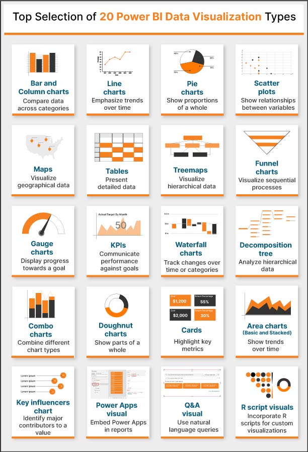
Formats of Power BI Data Visualization Include —
- Area charts (Basic and Stacked) to show trends over time.
- Treemaps to visualize hierarchical data, and many more.
- Pie charts to show the proportions of a whole.
- Q&A visual to use natural language queries.
- Doughnut charts to show parts of a whole.
2. Power BI Data Visualizations to Create Smart Dashboards
One report for all users? That’s a thing of the past.
Power BI data visualization offers customizable, dynamic, and smart dashboards catering to the needs of all users of your organization.
For example,
- Your ground-level workers dive into the intricacies of micro-level dashboards.
- While your team managers and decision-makers embrace a birds-eye view with macro-level dashboards.
This way, Power BI data visualization tools support the data visualization needs of all users across the team while bringing you the best of both worlds.
3. Power BI Visualizations for Anywhere & Everywhere Access
Say goodbye to systematically arranged files in your cabinet and embrace the seamless accessibility to edit, revise, or share Power BI dashboards and collaborate from anywhere with the Power BI mobile app.
The best part?
Power BI mobile app provides great compatibility with both Android and iOS operating systems, for an effortless data visualization experience wherever you go.
The key to effective Power BI data visualization development lies in understanding your data, knowing the data story you want to share, and choosing the right means to tell that story.
Now that we’ve explored how Power BI proves instrumental in your data visualization efforts, it’s time to look at some of the best ways to visualize your data with Power BI.
Best Ways to Visualize Data with Power BI
Now that you’re aware of the wide selection of data visualizations in Power BI, let’s understand what challenges it solves for you.
How Does Power BI Data Visualization Solve Your Data Challenges?
Every day your business generates data.
Data on customer interactions, staff, returns, marketing metrics, expenses, and other KPIs.
With so much data to filter through, it may be challenging for you to see the data story it weaves.
When used correctly, analyzing and visualizing data with Power BI helps you turn the entire data into understandable, visually appealing dashboards.
Thinking about – “How?”
Power BI data visualization simply unifies the data and employs AI-driven analytics to uncover the relationships between the data sets, current market trends, and the business world.
Now, let’s look at the common use cases for Power BI for data visualization.
1. Anomaly Detection in Credit Card Transactions
For banks & financial organizations nothing can be more frustrating than the customers defaulting on their payments!
Defaulted credits mean disturbed cash flow, administrative burdens, and an axe on your bank’s financial health.
Are you a CTO of a banking organization looking for a solution to smartly recognize and manage defaulting transactions?
Power BI data visualization has got you covered.
Thinking about – “How?”
Leveraging the power of Power BI data visualization tools, you will be enabled to connect transaction data from diverse sources and prepare a foundation to identify anomalies showcasing potential defaults in the future.
Through interactive and self-explanatory visualizations, Power BI empowers you to –
- Proactively manage defaulting transactions
- Enable early default detection
- Improve risk management
- Mitigate financial risk
The result?
You now have a prominent data-backed solution to identify credit defaulters beforehand and maintain your bank’s financial health while keeping your customers’ trust intact.
2. Customer Churn Prediction for Retail
High churn rates are a concern for retail businesses relying on repeat customers for profitability.
A high churn rate leads to lost recurring business opportunities, declining ROI, shooting customer acquisition costs & a negative impact on the profitability.
Are you a retail business owner seeking a solution to maintain existing customers and minimize the churn rate?
Data visualization in Power BI has got your back.
Thinking about – “How?”
Power BI data visualization empowers you to –
- Gauge customer data to obtain insights into churn patterns, bifurcate customer behavior, and signify possible churn risks.
- Analyze key metrics such as purchase frequency, customer engagement, and product preferences.
The result?
Leveraging customized data visualizations with Power BI, you are empowered to devise promising customer retention strategies, offering improved customer experience resulting in reduced customer churn & increased profitability.
3. Healthcare Sales Analysis
In the healthcare industry, sales are more than just revenue generation.
They are more about adept patient care, resources, and the efficiency of the entire system.
Poor healthcare sales performance means inadequate patient care, organizational ineffectiveness, and other serious consequences.
Are you a healthcare leader, seeking to boost patient care, organizational effectiveness, and ultimately enhance your organization’s sales performance?
Power BI Data Visualization is here for you.
Thinking about – “How?”
Leveraging Power BI data visualization tools, you are enabled to –
- Analyze service utilization patterns
- Get insights into patient demographics
- Track revenue streams from diverse data sources
- Assess the operational efficiency
- Measure patient satisfaction
The result?
By integrating these insights into your decision-making process, you are empowered to spot the areas for improvement, predict customer demand, personalize patient care, and even improved your business’s revenue cycle management.
Whether you are an IT manager of a retail business or a Chief Executive Officer of a healthcare establishment, Power BI data visualization proves to be instrumental in translating most of your business challenges into solutions.
Integrative Systems – Your Trusted Power BI Data Visualization Partner
To turn insights into impact has 2 prerequisites –
- Robust business intelligence tool i.e. Microsoft Power BI
- A trusted BI partner i.e. Power BI Consulting Partner
As a visionary business leader, we’re confident that you will settle for nothing less than the best for your business when it comes to choosing a Microsoft Power BI partner.
With proven expertise and over 10+ years of helping businesses, we, at Integrative Systems, would be happy to become a Power BI consulting partner of your choice and make your Power BI investments worthwhile.
Have a strong feeling that we are the match you’ve been looking for?
Drop us a line at [email protected] and our team of experts shall get back to you in 2 business days.